
Revenue-focused development for modern brands
Premium WooCommerce, Shopify and SaaS experiences built to look sharper and convert better.
We help growing brands ship fast, trustworthy digital experiences with cleaner UX, stronger performance, and development that supports growth instead of slowing it down.
What We Build
Not just websites
We build premium digital experiences for eCommerce and SaaS teams that want stronger positioning, smoother journeys and better performance.
Services
Simple solutions to help you grow your business.
We create solutions that make your website faster, stronger, and more effective.
01
eCommerce
WooCommerce and Shopify experiences tuned for faster product discovery, smoother checkout, and stronger trust signals.
Explore eCommerce02
SaaS Product & Dashboard Design
Premium dashboards, admin flows, and marketing sites that help startups look mature and launch confidently.
Explore SaaS03
Performance & CRO Optimization
Audit-based improvements that enhance speed, user experience, and conversions for better results.
Explore Optimization04
White-Label Development for Agencies
Reliable backend delivery for agencies that need a technical partner without risking client experience.
Explore White-LabelPortfolio
What We’ve Built.
See how our work has helped businesses improve performance and achieve better results.
Built on trust
Why Codepanther is the right partner.
Outcome-led messaging
We speak in business results, not generic dev language, faster stores, cleaner UX, more conversion confidence and scalable systems.
Transparent process
Every project is framed around scope, milestones, weekly updates and clear next steps, so clients feel in control.
Low-risk entry
Offer a paid audit or a focused starter sprint before a larger engagement to reduce commitment friction.
Premium presentation
A polished brand, intentional animation and clean structure instantly increase perceived quality and reliability.
Case Studies
Discover how we've helped our clients achieve their goals or transform their businesses.
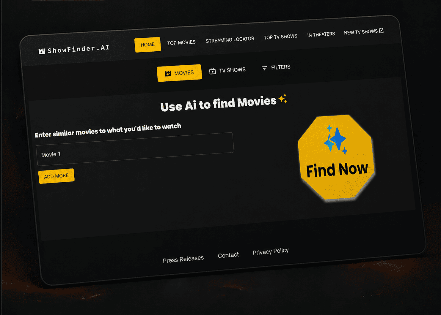
Next.js, React A Personalized Streaming Discovery Experience Powered by AI
The AI Entertainment Recommendation Platform was created to help users discover movies and TV shows tailored to their unique preferences and viewing habits.
- AI-powered personalized recommendations
- Fast and responsive user experience
- Modern and engaging interface
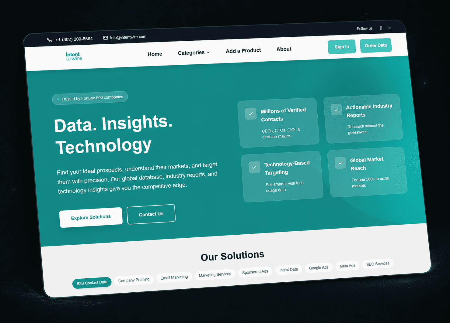
Next.js, React, Laravel Empowering B2B Growth with Data-Driven Lead Generation
IntentWire was built to help businesses connect with verified decision-makers, identify high-value prospects, and accelerate growth through reliable market intelligence.
- Professional B2B website experience
- Improved lead generation journey
- Clear service-focused navigation
Process
How We Deliver: Structured, Governed, Accountable.
Strategy & audit
We start by identifying conversion blockers, platform constraints, growth goals and scope priorities.
Direction & system
We define design direction, page hierarchy, motion language and reusable components before starting the build.
Build & polish
Development is handled with performance, responsiveness and premium interaction details in mind from day one.
Launch & support
We close with QA, deployment support and a handoff that gives clients confidence rather than confusion.
AUDIT-FIRST APPROACH
Lead with a focused audit, then scale into a premium implementation.
FAQ
Frequently Asked Questions About Working with Codepanther.
What types of projects are the best fit?
We are best suited for premium eCommerce builds, SaaS interfaces, performance improvements, and white-label delivery where quality and polish directly affect results.
Can we start with a smaller engagement first?
Yes. A focused audit or starter sprint is a great way to align on quality, speed and thinking before a larger project.
Do you handle both strategy and development?
Yes. We help shape the direction, improve the experience, and execute the build so the final result feels cohesive.